The rare Olivetti Graphika Typewriter: All you need to know.
In the late 1950s, deep within the exquisite landscapes of Italy, a revolution was quietly brewing. Little did the world know at the time, but a typewriter unlike any other was about to make its grand entrance.
This is the story of the Olivetti Graphika, a typewriter that defied convention and pushed boundaries. A typewriter ahead of its time.
Olivetti, the iconic Italian company, Founded by the visionary Camillo Olivetti, this company had always believed that design was more than just a casual affair – it was a way of life. From their factories to their advertising, every element screamed of aesthetic excellence. And their latest brainchild, the Olivetti Graphika, was no exception.
The Olivetti Graphika was one of the most ambitious projects of the company. It was based on the Olivetti Lexikon 80 model, which had a design patent issued for it in 1950². The patent lists Giuseppe Beccio as the inventor of the "Typewriter Frame" but that is incorrect. The design belongs to Marcello Nizzoli, a celebrated industrial designer who also worked on other Olivetti models, such as the Lettera 22 and the Studio 44 in collaboration with Beccio who was the engineer responsible for the mechanics of both the Lexikon 80 and the Graphika.
Launched in 1957 and produced until 1959, was manufactured in Ivrea -Italy and Glascow in Scotland, With only about 8,000 units produced as per online resources.
the Olivetti Graphika is now extremely rare and valuable, considered one of the most beautiful and sophisticated typewriters ever made. It's a testament to Olivetti's vision and legacy of pushing the boundaries of design and innovation.
The Olivetti Graphika was a typewriter that made waves in the industry for its revolutionary features, bringing together the worlds of engineering and artistry. But like any new innovation, it had its share of pros and cons.
Let's take a deeper look, as the Graphika was intended to be a high-end typewriter for professional and artistic use. It was available only with a glossy, pistachio finish, unlike other Olivetti models that came in various colors. It had two unique features that set it apart from other typewriters: proportional spacing and custom typefaces.
Proportional spacing means that each character has a different width, depending on its shape and size. For example, the letter "i" is narrower than the letter "m". This creates a more natural and harmonious look for the text, similar to typesetting or printing. To achieve this, the Graphika had a complex mechanism that advanced the carriage in 0.785mm increments, and depending on the width of the character, the carriage would advance .
The Olivetti Graphika typewriter featured two different ways of typing the text. Each typeface can be typed in two different ways. One with standard spacing, and the other with expanded spacing.
Now, what’s the difference?
With Standard spacing, your text layout will have normal spaces between the letters while with the expanded spacing, There will be a wider space between the letters thus creating a wider look of the document being typed.
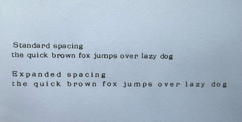
To clarify, the two spacebars on the Olivetti Graphika typewriter are not for individual characters but for different types of spacing between words.
One spacebar is for the standard fixed spacing, and the other is for expanded spacing. This allows for more control over the layout of the text, accommodating the proportional spacing of the characters. The typist could choose which spacebar to use based on the desired aesthetic of the document being typed. The mechanism was designed to enhance the visual appeal of the text, not to require a different spacebar for each character.
The left space bar advances the carriage by two unites while the one on the right advances the carriage by three units.
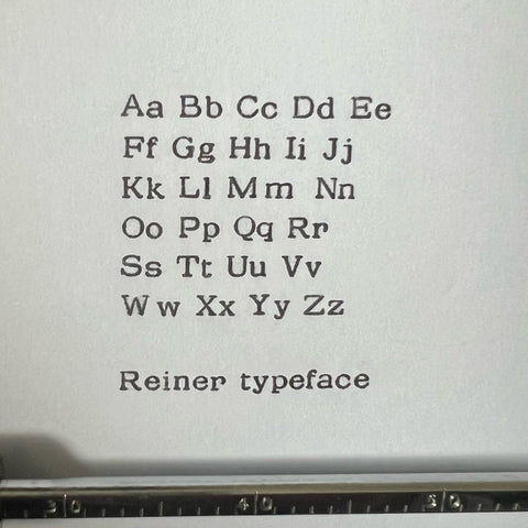
Custom typefaces mean that the Graphika had two exclusive fonts that were designed specifically for it by famous graphic designers. The first one was created by Imre Reiner, a Hungarian-Swiss designer who had a more modernist style.
The second one was created by A.M. Cassandre, a French designer who had a more stylized and expressive style. Both fonts were elegant and distinctive, and added a touch of artistry to the typewritten text.
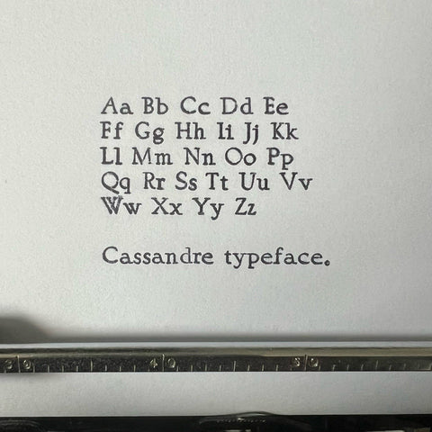
Together, they gifted the Graphika a touch of artistry that transformed typewritten words into poetry.
It is often said that pioneers ahead of their time are destined to face challenges. And the Olivetti Graphika was no exception.
It was a complex machine that was difficult to maintain and to repair, making it an expensive and time-consuming proposition.
With its delicate mechanisms, it was not uncommon for the Graphika to malfunction and jam, requiring a skilled technician to disassemble the machine and repair the internal parts.
Additionally, the Graphika had a steep learning curve that made it daunting to use.
In order to make the most of the proportional spacing feature, the user had to calculate the width of each character and adjust the backspacing accordingly.
The Graphika’s two spacebars, were found to confusing for some users when it came to spacing the text.
Not to forget that, not everyone could afford the Olivetti Graphika!! With its high price tag, it was an exclusive machine that was inaccessible and unaffordable for most users.
Since it was also only available in one color and two fonts, Although exclusive, it was often found to be limiting the options and variety for the user.
The Olivetti Graphika was a typewriter ahead of its time, combining innovation, elegance, and artistry. But it was also a typewriter that was complex, difficult to master, and expensive to maintain.
Despite this, it earned admiration and stands as a significant historical symbol of typewriter innovation and design.